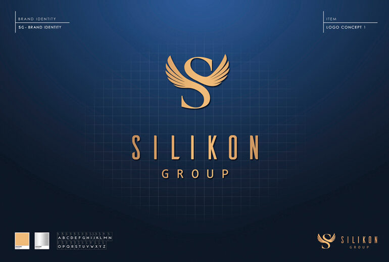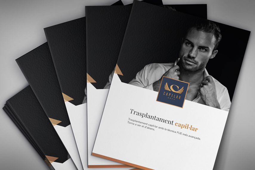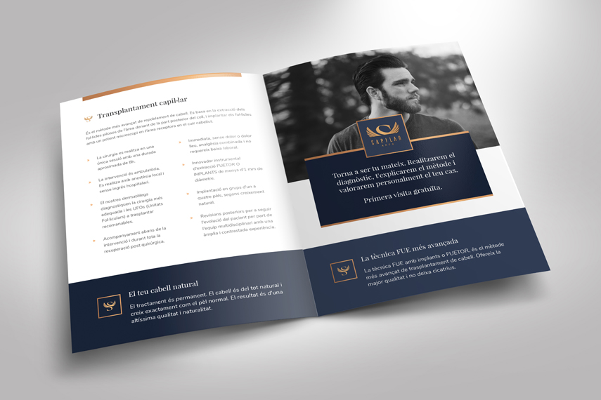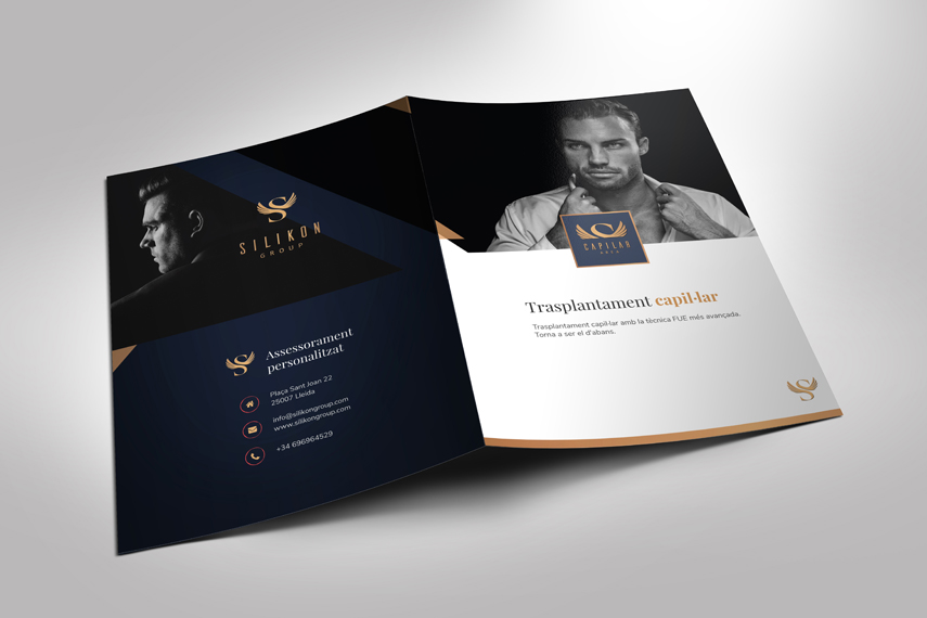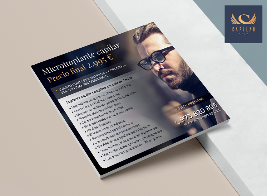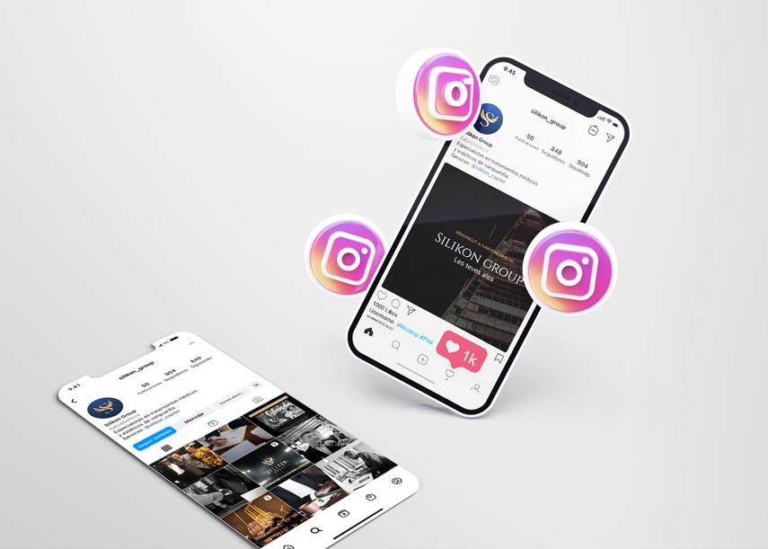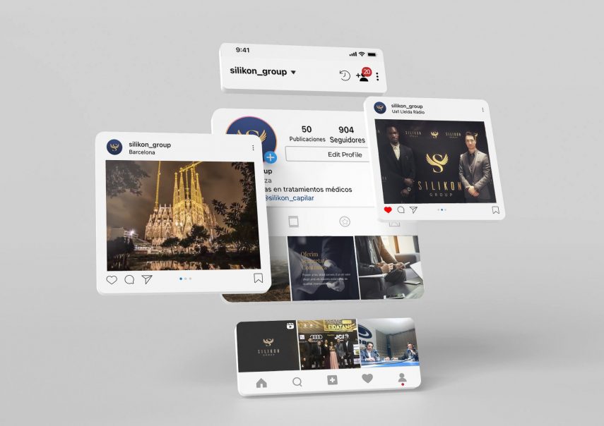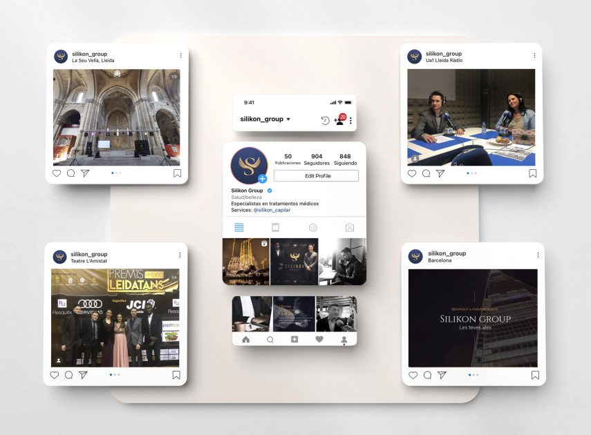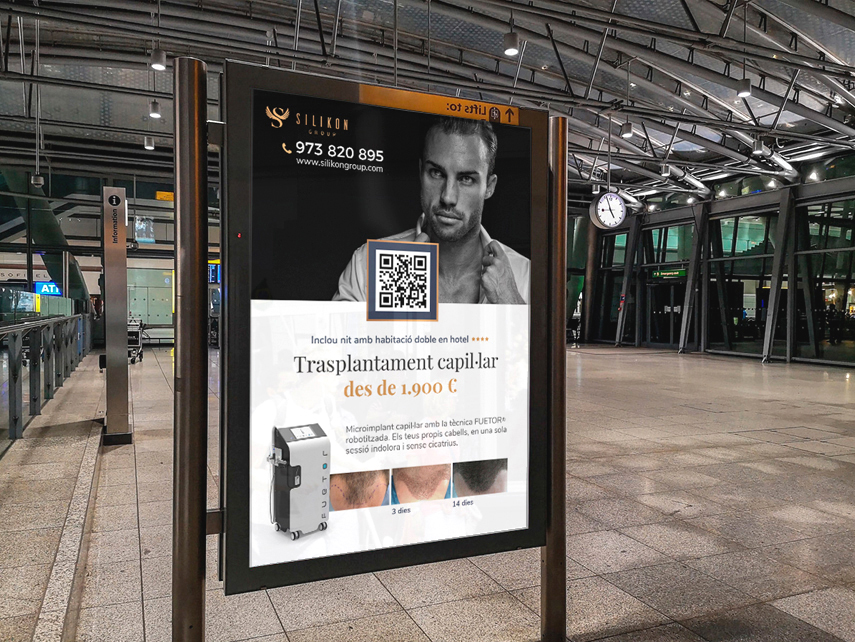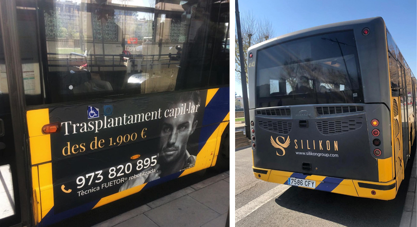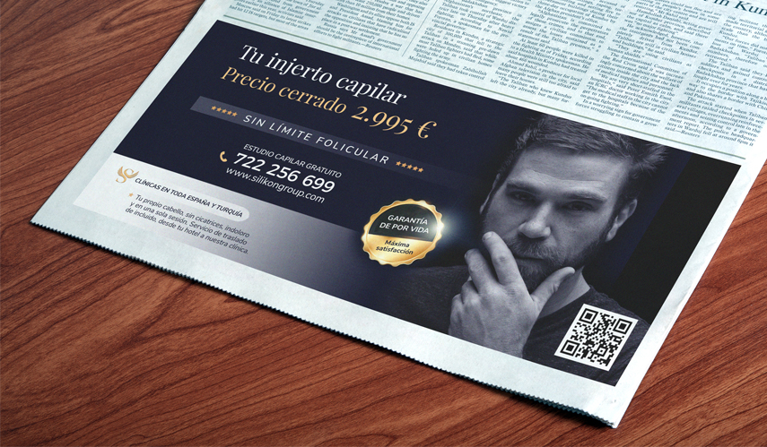

The main challenge of this project is creating an image for a brand from scratch. The idea was born from generating a space which connects medical-aesthetic professionals with potential clients. The service focused on hair implants for men. With this product and this target, the corporate image had to convey trust, seriousness, solidity, experience and professionalism; something rather difficult for a start-up company to do. To achieve this, I needed a logo with the classic spirit of a great brand, so I chose the font very carefully. I designed a symbol that was powerful yet dynamic. The initials of the brand become a swan that comes out of the lake to finally fly. The dark blue color represents seriousness and professionalism, while the gold gives a feeling of exclusivity and elegance. If we put all these elements together, we have a newly created company with the perceived values of a long-standing consolidated brand. The result speaks for itself.
Role: Art director, Copywriter & Graphic designer / Solo project